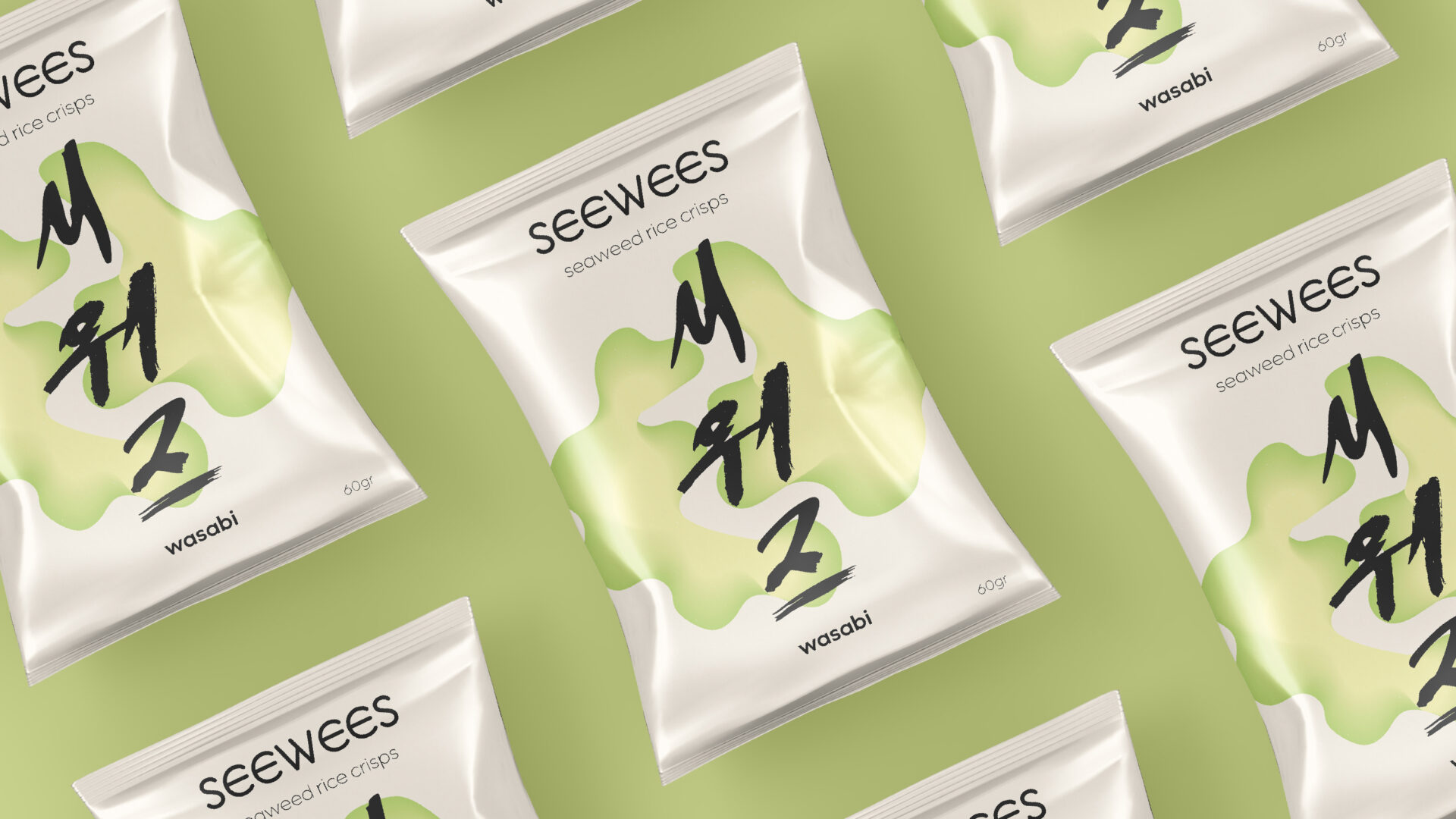
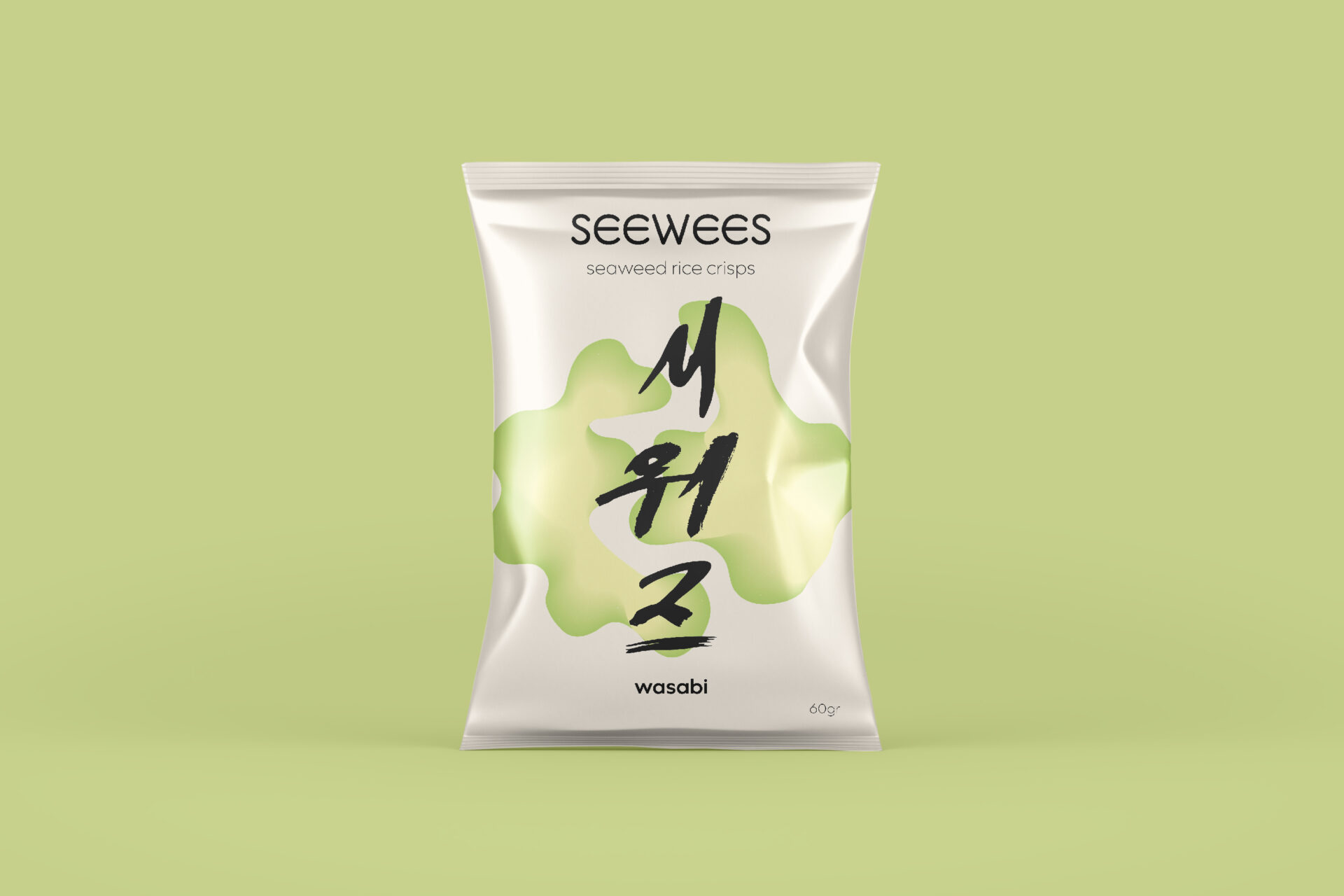
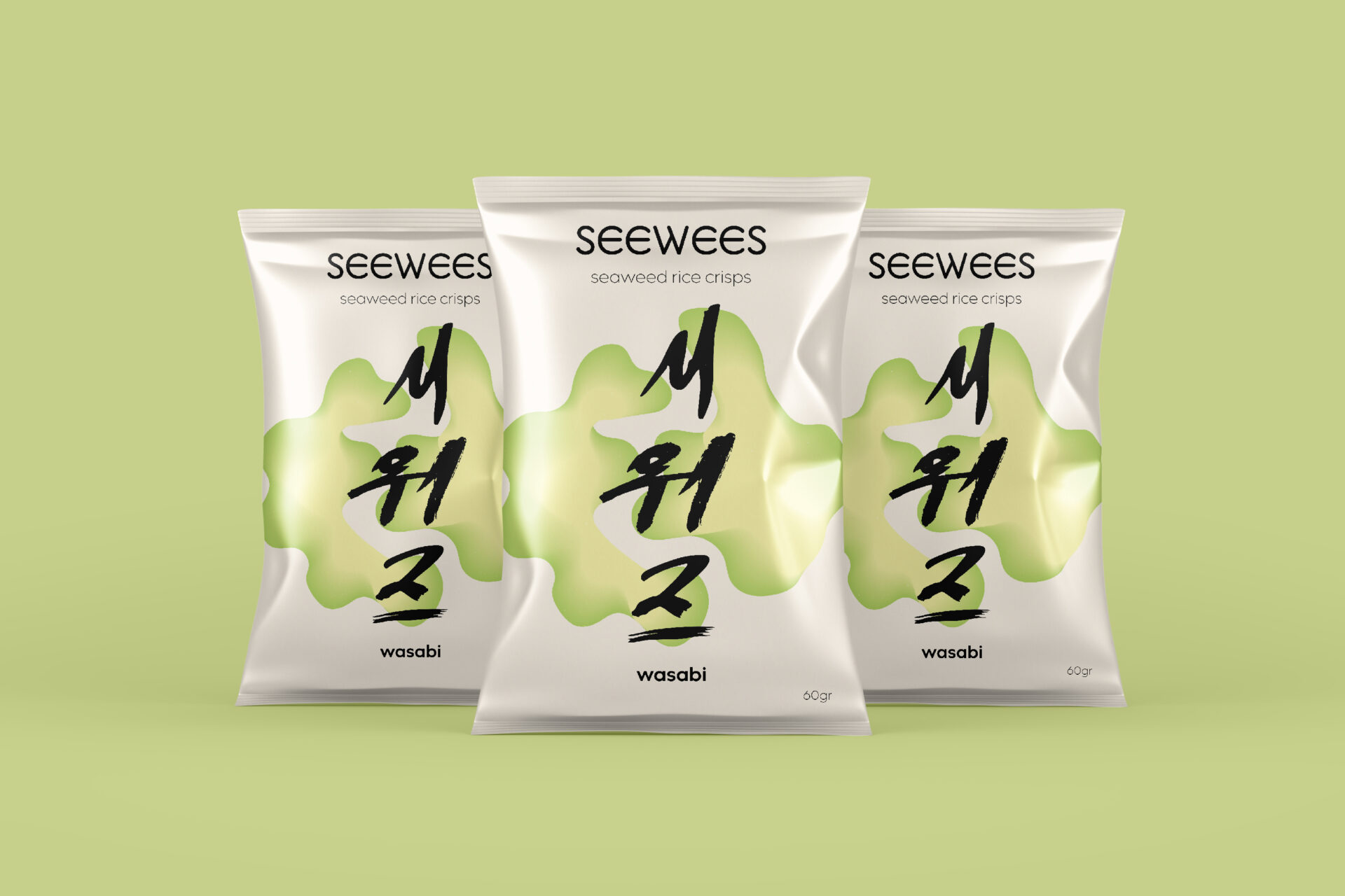
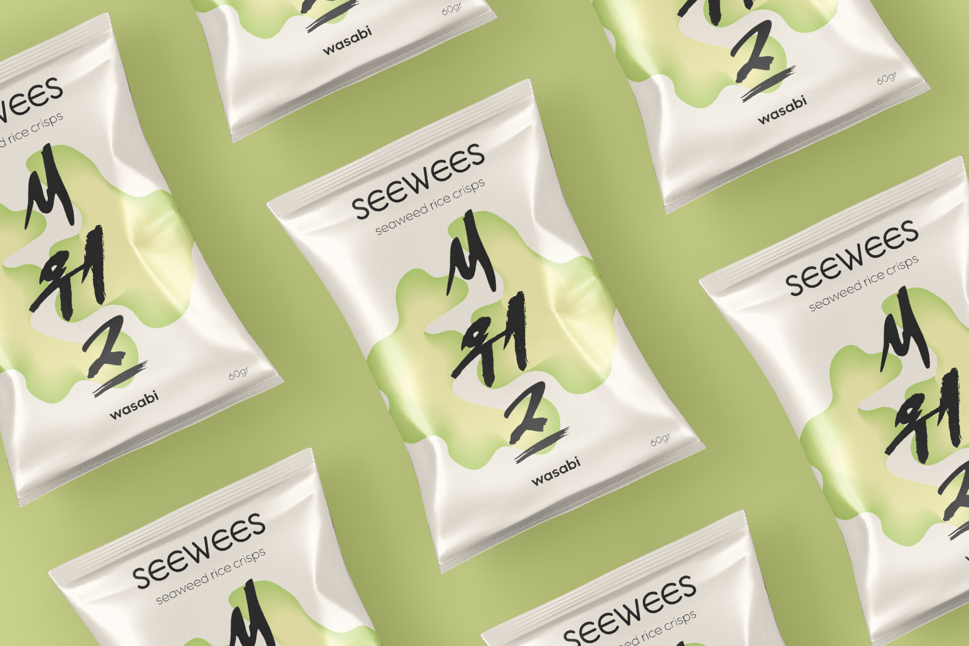
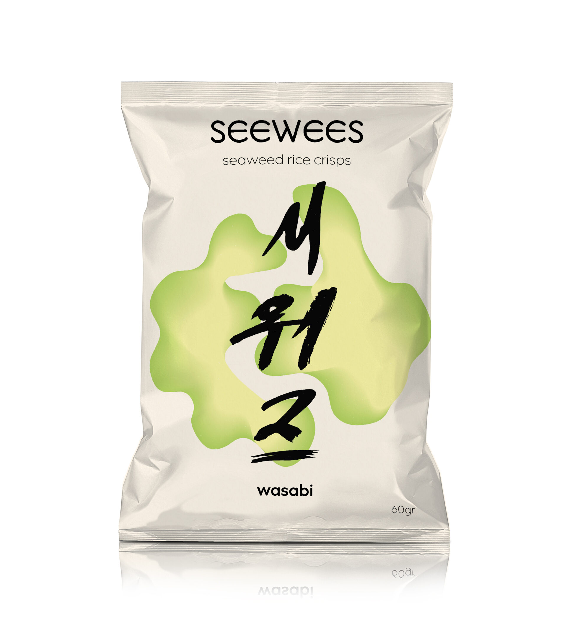
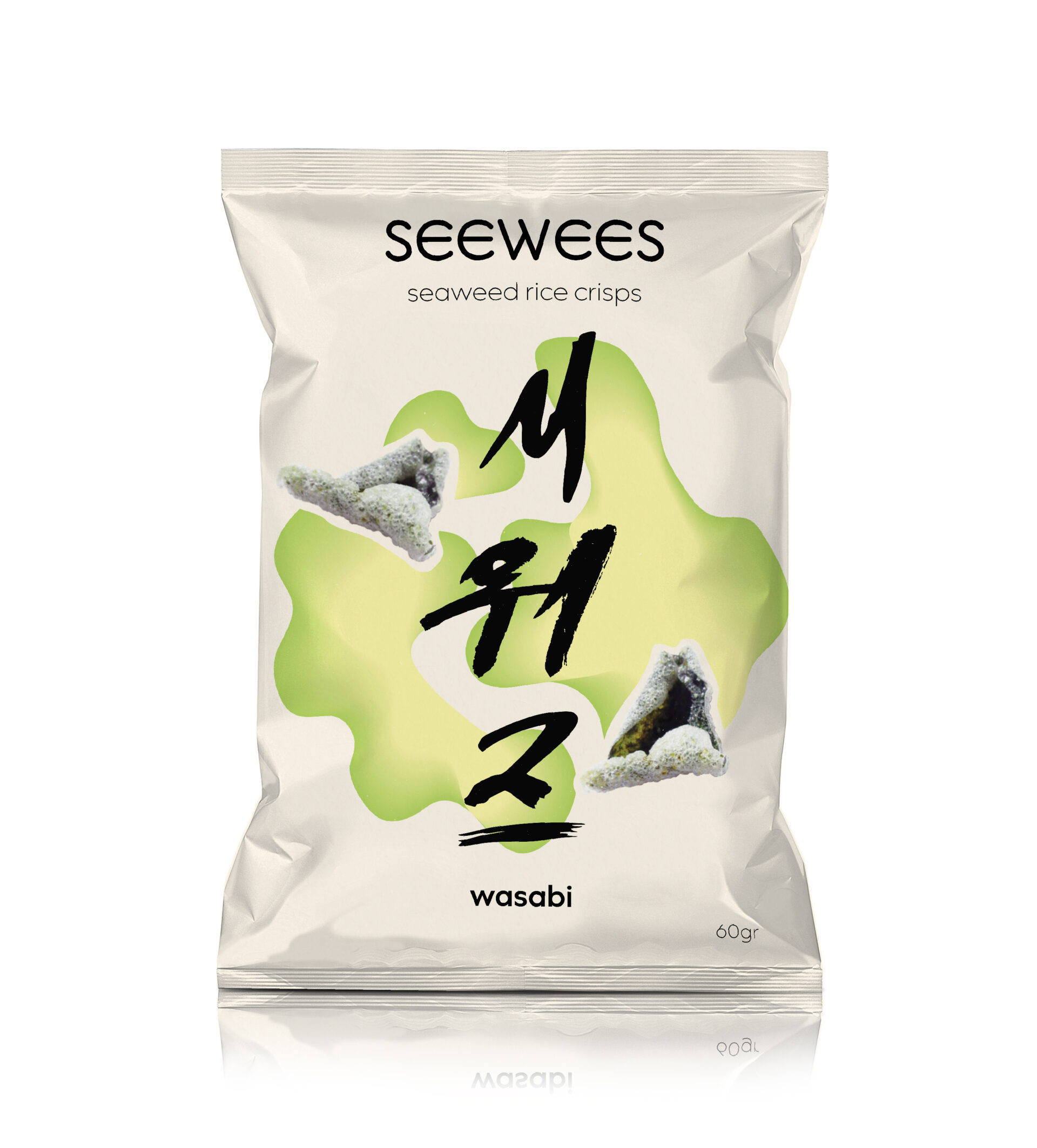
SEEWEES is a seaweed rice crisps snack brand that brings a fresh and playful twist to healthy snacking. This packaging design project focuses on creating a visually engaging and eco-conscious identity that reflects the product’s ocean-inspired origins and clean ingredients. With bold typography, organic textures, and vibrant colors, the design aims to stand out on shelves while appealing to health-conscious and adventurous snackers. The goal was to capture the light, crispy essence of SEEWEES in a package that’s both fun and functional, enhancing the overall brand experience from first glance to final bite.
My ideations explored a ‘Korean Classic’ approach and a pharmaceutical ‘Healthy Modern’ one. Whilst exploring both, I decided to combine them to create a modern pacakging with a traditional twist, adding the handwritten Hanguel (Korean) that reads ‘Seewees’ (시위즈) in traditional calligraphic type. I also implemented a gradient shape, representing seaweed and kept the pacakging clean and simple, so that the accent would fall onto the type and shape forms.